
素材准备:images
源码:压缩包
一、布局分析
效果图:
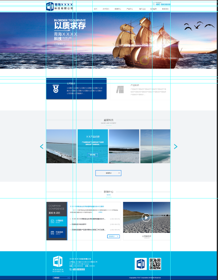
布局大至可分为6部分:
1.头部:宽:1100px 高:106px
2.广告牌:宽:100% 高:500px
3.公司简介:宽:1100px 高:180px 上下margin:95px
4.公司产品:宽:100% 高:630px
5.新闻中心:宽:1100px 高:445px 上下margin:90px
6.尾部:宽:100% 高:250px
简单实现:
HTML代码:
<!DOCTYPE html>
<html lang="en">
<head>
    <meta charset="UTF-8">
    <title>Title</title>
    <link rel="stylesheet" type="text/css" href="css/style.css">
</head>
<body>
    <div class="header"></div>
    <div class="banner"></div>
    <div class="about"></div>
    <div class="por"></div>
    <div class="news"></div>
    <div class="footer"></div>
</body>
</html>
CSS代码:
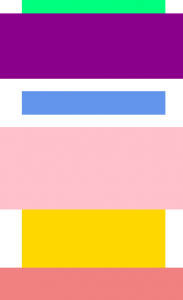
*{margin: 0;padding: 0;}

.header{
    width: 1100px;
    height: 106px;
    margin: 0 auto;
    background: #00FF7F;
}

.banner{
    width: 100%;
    height: 500px;
    background: #8B008B;
}

.about{
    width: 1100px;
    height: 180px;
    margin: 95px auto;
    background: #6495ED;
}

.por{
    width: 100%;
    height: 630px;
    background: #FFC0CB;
}

.news{
    width: 1100px;
    height: 445px;
    margin: 0 auto;
    background: #FFD700;
}

.footer{
    width: 100%;
    height: 250px;
    background: #F08080;
}
效果图:
二、头部实现
头部分析:
1.logo部分
宽:236px 高:82px top值:12px
因为有top值,所以这个元素是绝对定位,而父级容器也要因此设置相对定位,让父级容器还处于文档流中,而该元素可以移动。(定位详情)
2.咨询我们部分
该元素大小不定,让内容决定,top值:16px,right值:0px。因为是绝对定位,处理同logo。
为了让电话显示出来,设置内容的padding-left值为35px,背景位置left,背景大小8px。
文字大小12px,颜色#888;电话:大小20px,颜色#00b3e1,字体粗细:900,行高1em(要注意的是字体的类型会影响字体大小,所以要在最上面声明全页面字体为微软雅黑。)
3.导航条部分
导航条这种重复的东西用<ul>序列。记得去掉<ul>的样式
先设置导航条的基本<div>的高为50px,宽度包裹内容(不管),绝对定位与右下角。(处理方法同上)
然后<div>内的<li>标记左浮动,<li>标记下有一个<a>标记和一个<i>标记,本身均是内联元素,进行块元素转换。这里要监听鼠标的动作,所以先写鼠标为选中时的样式。
<a>标记的字想让其居中,直接设置padding的左右值为24px,这里也就是为什么不设置导航条的宽度原因。字体颜色#333,大小14px,行高和父容器一致。
<i>标记,由于未选中,宽度未0%,高度设置3px,背景颜色:#00b3e1,其位置是绝对定位left:50%,bottom:0px。监听鼠标选中后的反应速度为0.3s。
当鼠标选中后:
<a>标记字体颜色变为:#00b3e1
<i>标记的left值变为0,宽度变为100%。让其选中后从中间出现(自己研究一下,挺有趣的)。
由于首页项本身默认选中,所以将选中的状态直接定义给它。
代码实现:
HTML代码:
<div class="header">
    <a href="#" class="hd_logo"><img src="images/logo.png" alt=""></a>
    <div class="tel">
        咨询电话:
        <p>15769589096</p>
    </div>
    <div class="nav">
        <ul>
            <li class="on"><a href="#">首页</a><i></i></li>
            <li><a href="#">关于我们</a><i></i></li>
            <li><a href="#">新闻中心</a><i></i></li>
            <li><a href="#">产品中心</a><i></i></li>
            <li><a href="#">旗下企业</a><i></i></li>
            <li><a href="#">在线留言</a><i></i></li>
            <li><a href="#">联系我们</a><i></i></li>
        </ul>
    </div>
</div>
CSS代码:
.header{
    width: 1100px;
    height: 106px;
    margin: 0 auto;
    position: relative;
}

.header .hd_logo{
    display: block;
    position: absolute;
    top: 12px;
}

.header .tel{
    margin: 0px;
    background: url("../images/icon_bg.png") no-repeat left 8px;
    position: absolute;
    top: 16px;
    right: 0;
    padding-left: 35px;
    font-size:12px;color:#888;
}

.header .tel p{
    font-size:20px;
    color:#00b3e1;
    font-weight:900;
    line-height:1em;
}

.header .nav {
    height: 50px;
    position: absolute;
    bottom: 0;
    right: 0;
}

.header .nav li{
    float: left;
    position: relative;
}

.header .nav li a{
   display: block;
    line-height: 50px;
    font-size:14px;
    color:#333;
    padding: 0 24px;
}

.header .nav li i{
    display: block;
    width: 0%;
    height: 3px;
    background: #00b3e1;
    position: absolute;
    bottom: 0;
    left: 50%;
    transition: 0.3s;
}

.header .nav .on a,.header .nav li:hover a{color: #00b3e1;}
.header .nav .on i,.header .nav li:hover i{left: 0;width: 100%;}
效果图:

三、广告图实现(后期实现轮播图)
直接把图片插入即可
CSS代码:
.banner{
    width: 100%;
    height: 500px;
    background:url(../images/banner1.jpg) no-repeat center;
}
四、公司简介实现
分析:
该部分由两块div实现,分别左右浮动与父级元素。div分为选中状态和未选中状态。由于两个块由相同的地方也有不同的地方,则先写他们的相同点
1.相同点
div宽534px,高180px,边框#eee,1px的直线。鼠标选中后0.3反应时间。div里面的图片用<i>标记,宽高72px,绝对定位上左50px。具体字体看代码。
div选中之后背景颜色变为#00408F,边框也是#00408F。<i>标记背景变化。反应时间:0.3s具体字体看代码。
2.不同点(以左边为例)
div为左浮动,由于大部分小图片都在一张图片里面,所以这里要设置i标记的背景图片的位置。选中之后再次更改背景图的位置
代码实现:
HTML代码:
<div class="about">
    <div class="box box_l">
        <i></i>
        <h2>公司简介</h2>
        <p>公司简介公司简介公司简介公司简介公司简介公司简介公司简介公司简介公司简介</p>
    </div>
    <div class="box box_r">
        <i></i>
        <h2>公司简介</h2>
        <p>公司简介公司简介公司简介公司简介公司简介公司简介公司简介公司简介公司简介</p>
    </div>
</div>
CSS代码:
.about{
    width: 1100px;
    height: 180px;
    margin: 95px auto;
}
/*相同点*/
.about .box{
    width: 534px;
    height: 180px;
    border: #eee 1px solid;
    position: relative;
    transition: 0.3s;
}
.about .box:hover{
    background: #00408f;
    border: #00408f 1px solid;
}

.about .box i{
    width: 72px;
    height: 72px;
    position: absolute;
    top: 50px;
    left: 50px;
    background: url("../images/icon_bg.png");
}

.about .box h2{
    position:absolute;
    top:50px; left:180px;
    font-size:18px;
    color:#666;
    font-weight:100
}
.about .box:hover h2{
    color:#fff;
}

.about .box p{
    position:absolute;
    top:80px;
    left:180px;
    font-size:14px;
    color:#aaa;
    width:320px;
}
.about .box:hover p{
    color:#a1aec8;
}

/*不同点*/
.about .box_l{
    float: left;
}

.about .box_r{
    float: right;
}

.about .box_l i{
    background-position:left -29px;
}
.about .box_l:hover i{
    background-position:left -101px;
}

.about .box_r i{
    background-position:left -173px;
}
.about .box_r:hover i{
    background-position:left -245px;
}
效果图:

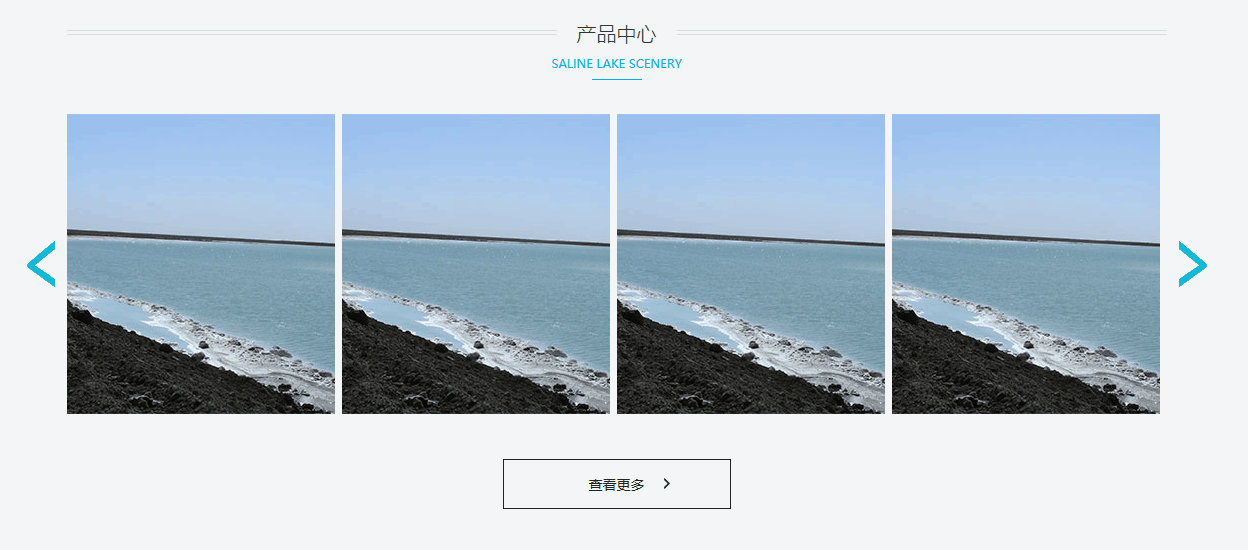
五、产品区域
分析:
该部分大致可分未三个区域:标题、内容、更多
1.标题
由于标题在后面也用到了,所以这里我们先单独把标题写出来,后面再用的时候,换一下文字就好了。
标题的内容主要是后面的背景图,一个<h2>标记、一个<p>标记、<i>标记。先实现后面的横线(用一个小背景图向x轴重复),再设置一下字体样式并居中。具体看代码。
HTML代码:
<div class="title">
    <h2>产品中心</h2>
    <p>Saline Lake scenery</p>
    <i></i>
</div>
CSS代码:
.title{
    width: 1100px;
    background: url("../images/title_bg.png") repeat-x center 10px;
    margin: 0 auto;
    text-align: center;
    position: relative;
    top: 75px;
    bottom: 35px;
}
.title h2{
    font-size:20px;
    color:#333;
    font-weight:100;
    background:#f2f4f6;
    display:inline-block;
    padding:0 20px;
}
.title p{
    font-size:12px;
    color:#00b3e1;
    text-transform:uppercase;
    line-height:1em;
    margin:10px 0;
}
.title i{
    width:50px;
    height:1px;
    display:block;
    background:#00b3e1;
    position: absolute;
    left: 50%;
    margin-left: -25px;
}
效果图:
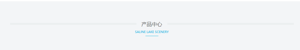
之后在新闻中心应用的时候,只需要再改一下文字就好了。不过我们因为一些绝对定位的操作,把我们的title这个div搞飞起来了(也就是接下来的元素会出现在它的后面),这里我的解决办法就是再写一个div高度和title相应缺失的高110px一样就行。让它代替title在底层的文本流。
2.产品内容
该部分用三个div。中间用ul实现,并且多余li的溢出处理是隐藏。两边的小按钮先是一个高为300px,宽为40px的div中有一个<i>标签。。由于这里的按钮也有相同之处,所以处理内容和上面的公司简介差不多,先写相同点,再写不同点。代码如下。
HTML代码:
<div class="c"></div>
<div class="con">
    <div class="btn btn_l"><i></i></div>
    <div class="out">
        <ul>
            <li><a href="#"><img src="images/pro1.jpg" alt=""></a></li>
            <li><a href="#"><img src="images/pro1.jpg" alt=""></a></li>
            <li><a href="#"><img src="images/pro1.jpg" alt=""></a></li>
            <li><a href="#"><img src="images/pro1.jpg" alt=""></a></li>
            <li><a href="#"><img src="images/pro1.jpg" alt=""></a></li>
            <li><a href="#"><img src="images/pro1.jpg" alt=""></a></li>
        </ul>
    </div>
    <div class="btn btn_r"><i></i></div>
</div>
CSS代码:
.c{
    height: 110px;
}

.por .con{
    width: 1180px;
    height: 300px;
    margin: 0 auto;
}

.por .con .btn{
    width: 40px;
    height: 300px;
    float: left;
    cursor: pointer;
}
.por .con .btn i{
    display:block;
    width:28px;
    height:46px;
    background: url("../images/icon_bg.png");
    margin-top: 127px;
}

.por .con .btn_l i{
    background-position: 0 -317px;
}
.por .con .btn_r i{
    background-position:-28px -317px;
    margin-left:12px;
}

.por .con .out{
    width: 1100px;
    height: 300px;
    overflow: hidden;
    float: left;
}

.por .con .out li{
    float: left;
    margin-right: 7px;
}
效果图:

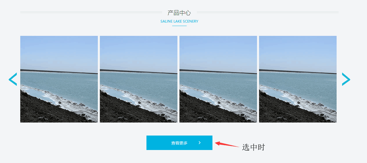
3.更多按钮
这个按钮是会监听鼠标的,所以它有两种状态,两种状态有共同点,也有不同点。先写共同点。具体看代码:
HTML代码:
<a href="#" class="more">
    <p>查看更多</p>
    <i></i>
</a>
CSS代码:
.por .more{
    width:226px;
    height:48px;
    border:1px solid #202524;
    display:block;
    text-align:center;
    line-height:48px;
    font-size:14px; color:#202524;
    position:relative;
    transition:0.3s;
    margin: 45px auto 0;
}
.por .more i{
    display:block;
    width:6px;
    height:11px;
    background:url(../images/more_bg.png) no-repeat;
    position:absolute;
    top:18px;
    left:160px;
    transition:left 0.3s;
}
.por .more:hover {
    background:#00b3e1;
    color:#fff;
    border:1px solid #00b3e1
}
.por .more:hover i{
    background-position:left -11px;
    left:180px;
}
效果图:
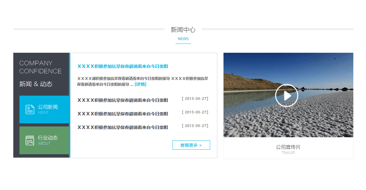
六、新闻中心
分析:
首先一个标题和上面的产品一样,调用过来。因为之前写的title的h2背景是灰色的,我们再把news底下的title的h2的背景颜色重写一下为white。而且这里位置也有些不对。打开浏览器审查元素。可以知道是title的top多出来了。重写成0 。
接下来是一个div。里面有两个一个左浮动,一个右浮动。
具体细节自己用浏览器打开源码,审查元素。这里不难,只是复杂。
HTML:
<div class="news">
    <div class="title">
        <h2>新闻中心</h2>
        <p>NEWS</p>
        <i></i>
    </div>
    <div class="news_con">
        <div class="news_main">
            <div class="news_l">
                <i></i>
                <h2>新闻 & 动态</h2>
                <div class="news_box box_t">
                    <i></i>
                    <h3>
                        公司新闻
                        <span>NEWS</span>
                    </h3>
                </div>
                <div class="news_box box_d">
                    <i></i>
                    <h3>
                        行业动态
                        <span>ABOUT</span>
                    </h3>
                </div>
            </div>
            <div class="news_r">
                <div class="news_text">
                    <div class="text_top">
                        <h4>
                            <a href="#">XXXX积极参加抗旱保春耕请看来自今日贵阳</a>
                            <p>XXXX湖积极参加抗旱保春耕请看来自今日贵阳的报导 XXXX积极参加抗旱保春耕请看来自今日贵阳的报导 ... <a href="#">[详情]</a> </p>
                        </h4>
                    </div>
                    <div class="text_list">
                        <h4>
                            <a href="#" >XXXX积极参加抗旱保春耕请看来自今日贵阳</a>
                            <span>【 2015-08-27】</span>
                        </h4>
                        <h4>
                            <a href="#" >XXXX积极参加抗旱保春耕请看来自今日贵阳</a>
                            <span>【 2015-08-27】</span>
                        </h4>
                        <h4>
                            <a href="#" >XXXX积极参加抗旱保春耕请看来自今日贵阳</a>
                            <span>【 2015-08-27】</span>
                        </h4>
                    </div>
                    <div class="text_btn">
                        <a href="#">查看更多 ></a>
                    </div>
                </div>
            </div>
        </div>
        <div class="news_video">
            <img src="images/video_img.jpg" alt="">
            <div class="text">
                <h4>
                    公司宣传片
                    <span>Trailer</span>
                </h4>
            </div>
        </div>
    </div>
</div>
CSS代码:
.news{
    width: 1100px;
    height: 445px;
    margin: 90px auto;
}

.news .title{top: 0;}
.news .title h2{
    background: white;
}

.news .news_con{
    width: 1100px;
    height: 340px;
    margin-top: 40px;
}

.news .news_con .news_main{
    width: 660px;
    height: 340px;
    float: left;
    background: #00b3e1;
}

.news_l{
    width: 160px;
    height: 340px;
    float: left;
    padding-left: 20px;
    background: #3f434c;
}

.news_l i{
    display: block;
    width: 136px;
    height: 42px;
    margin-top: 25px;
    background: url("../images/news_left_text.png") no-repeat;
}

.news_l h2{
    font-size: 20px;
    color: #fff;
    font-weight: 100;
    margin: 20px 0 25px;
}

.news_box{
    width: 160px;
    height: 90px;
    margin-bottom: 10px;
    position: relative;
}

.news_box i{
    display: block;
    width: 28px;
    height: 31px;
    position: absolute;
    top: 30px;
    left: 20px;
    margin-top: 0;
}

.news_box h3{
    position: absolute;
    top: 25px;
    left: 60px;
    font-size: 16px;
    font-weight: 100;
    color: #fff;
}

.news_box span{
    font-size: 12px;
    color: #a3dbf0;
    display: block;
}

.box_t{
    background: #00b3e1;
}
.box_t i{
    background: url("../images/iconfont-xinwen.png") no-repeat;
}

.box_d{
    background: #609969;
}
.box_d i{
    background: url("../images/iconfont-industry-report.png") no-repeat;
}

.news_r{
    width: 474px;
    height: 340px;
    float: right;
    background: white;
    border: 1px solid #d0d0d0;
    position: relative;
}

.news .news_con .news_video{
    width: 420px;
    height: 340px;
    float: right;
}


.news .news_con .news_video .text{
    border: 1px solid #eee;
    width: 418px;
    height: 65px;
    text-align: center;
}

.news .news_con .news_video .text h4{
    padding-top: 15px;
    font-size: 16px;
    color: #3f434c;
    font-weight: 100;
}

.news .news_con .news_video .text h4 span{
    display: block;
    text-transform: uppercase;
    font-size: 12px;
    color: #b0b1b4;
}

.news_text{
    width: 430px;
    height: 308px;
    position: absolute;
    left: 50%;
    margin-left: -215px;
    bottom: 1px;
}

.text_top{
    width: 100%;
    height: 100px;
}

.text_top h4 a{
    color: #00b3e1;
    font-size: 14px;
}

.text_top h4 p{
    font-size: 12px;
    color: #666;
    line-height: 1.6em;
    margin-top: 20px;
}

.text_list{
    width: 100%;
    height: 132px;
    margin-top: 10px;
}

.text_list h4{
    height: 44px;
}

.text_list a{
    font-size: 14px;
    color: #3f434c;
    line-height: 1em;
}

.text_list span{
    float: right;
    font-size: 12px;
    color: #9e9fa3;
    line-height: 1em;
}

.text_btn{
    width: 120px;
    height: 28px;
    border: #00b3e1 1px solid;
    position: absolute;
    right: 0;
    text-align: center;
    margin-top: 10px;
}

.text_btn a{
    line-height: 28px;
    color: #00b3e1;
    font-size: 14px;
}
效果图:
七、心得
1.在写前端时,要大布局划小布局。先用颜色块将位置定义好。
2.在自己写一个布局的大小时,可以在浏览器中打开自己写的布局审查元素,然后在浏览器中改写代码(键盘的上下左右可以快速调宽高),满意后再将代码复制到本地。
3.创新源于模仿,要学会在浏览器上抄别人的代码。